BioGrace
Type
Product Design
Timeline
September 2025 - December 2025

Project Overview
BioGrace is a medication management tool designed to help older adults, patients, and caregivers manage complex prescription routines with more clarity and confidence. Created as part of the Michigan Ross Business+Tech Innovation Jam, BioGrace simplifies medication tracking through AI-powered label scanning, personalized reminders, caregiver support, and an AI assistant named Gracie.
As a product designer, I developed the brand system, contributed to a scalable UI component library, mapped key user flows, designed mid-fidelity wireframes, and helped build the final interactive prototype using Figma Make.
Problem Statement
Older adults and caregivers managing multiple medications often struggle to keep track of changing schedules, dosage instructions, refill timelines, and communication across care teams. Many users rely on memory, paper notes, or scattered information from providers, which can lead to confusion, missed doses, and added stress.
Users needed a centralized, intuitive tool that could help them track medications, understand what each medication is for, receive timely reminders, and share important information with caregivers or providers.
Audience + User Personas
BioGrace was designed for two main user groups:

*User persona overview
Family caregivers managing medications for an older adult or loved one.
Older adults or patients managing their own medications.
To guide our design decisions, we created personas representing both caregiver and patient needs. This helped us design for shared oversight while still supporting independence, routine clarity, and confidence for patients managing their own care.
Design Goals
Create a centralized medication dashboard where users can view medications, schedules, reminders, and daily progress in one place.
Simplify medication input through AI-powered label scanning while still allowing manual entry.
Use plain language, clear visual hierarchy, and guided prompts to make medication information easier to understand.
Support caregivers through shared reminders, SMS notifications, and exportable medication reports.
Design a calm, accessible, and trustworthy interface for users navigating stressful healthcare routines.
Research + Insights
We began by researching how older adults, patients, and caregivers currently manage medication routines. Our research showed that many users rely on memory or paper notes to track medication intake, and many struggle to remember complex schedules.
We also identified three key pain points:
Medication information is scattered.
Medication instructions are difficult to understand.
Communication across caregivers is inconsistent.
To better understand the existing landscape, we analyzed medication tracking apps such as MediSafe, MyTherapy, and Mango Health. While many of these tools offered reminders or medication lists, we found gaps in accessibility, caregiver support, visual clarity, and plain-language medication explanations.
*A closer look at my analysis of 'Medisafe'
These insights shaped our direction: BioGrace needed to be more than a reminder app. It needed to be a supportive system that helped users organize, understand, and communicate medication information with less stress.
Information Architecture + User Flows
Using our research, we mapped end-to-end user flows around BioGrace’s core actions:
Onboarding as a patient or caregiver.
Adding medications manually or through AI label scanning.
Setting medication schedules, reminders, and priority levels.
Viewing daily medication tasks through a centralized dashboard.
Chatting with Gracie, the AI medication assistant.
Managing caregiver permissions and SMS reminders.
Exporting medication reports for providers or family members.
*Medication input user flow
Mapping these flows early helped us organize a complex experience into clear, manageable steps. It also helped us define role-specific needs for caregivers and patients, including differences in visibility, control, and responsibility.
Visual Identity
Because BioGrace exists within a healthcare context, the visual identity needed to feel calm, clear, and trustworthy. I created a soft color palette, readable typography system, and friendly iconography to make the experience feel supportive rather than clinical or overwhelming.
The BioGrace logo was designed around three core ideas: caregiver confidence, medication adherence, and healthcare connection. These values guided the overall brand system and helped create a more approachable experience for users managing sensitive health information.
*Typography, colors and logo
Component Library
After defining the visual direction, I built a scalable UI component library to support the product experience. This included medication cards, buttons, form fields, navigation elements, progress indicators, notification cards, medication type icons, and priority tags.
Since BioGrace relies on repeated patterns across medication entry, reminders, schedules, and dashboard views, the component library helped keep the interface consistent and easier to scale.
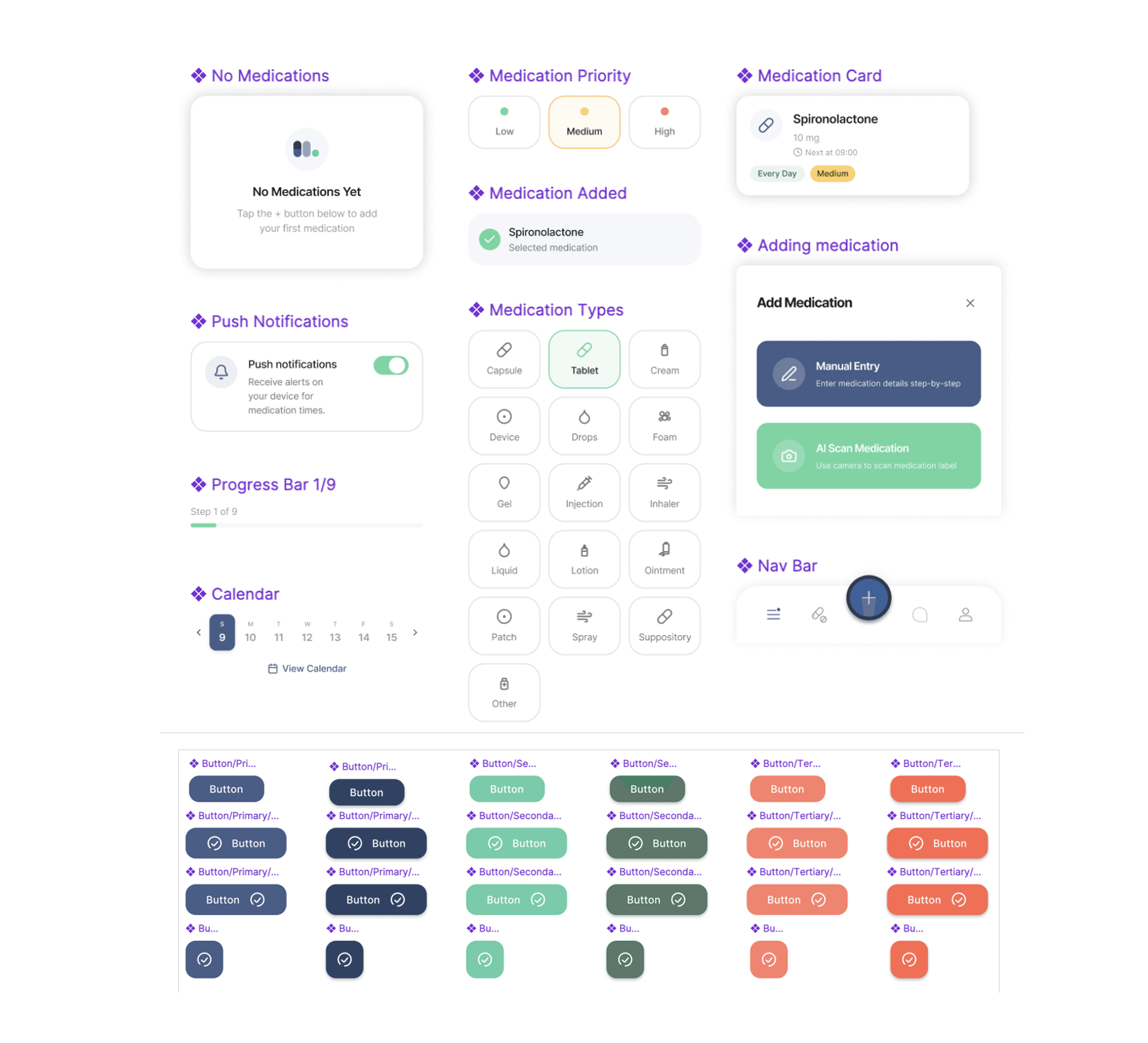
*Component library
Mid-Fi Wireframes
Once the main flows were mapped, we created mid-fidelity wireframes for both caregiver and patient journeys. These screens focused on reducing cognitive load through simple layouts, large touch targets, clear labels, and predictable navigation.
We paid close attention to the emotional context of the experience. Users managing medication routines may already feel overwhelmed, so the interface needed to provide reassurance without adding unnecessary complexity.
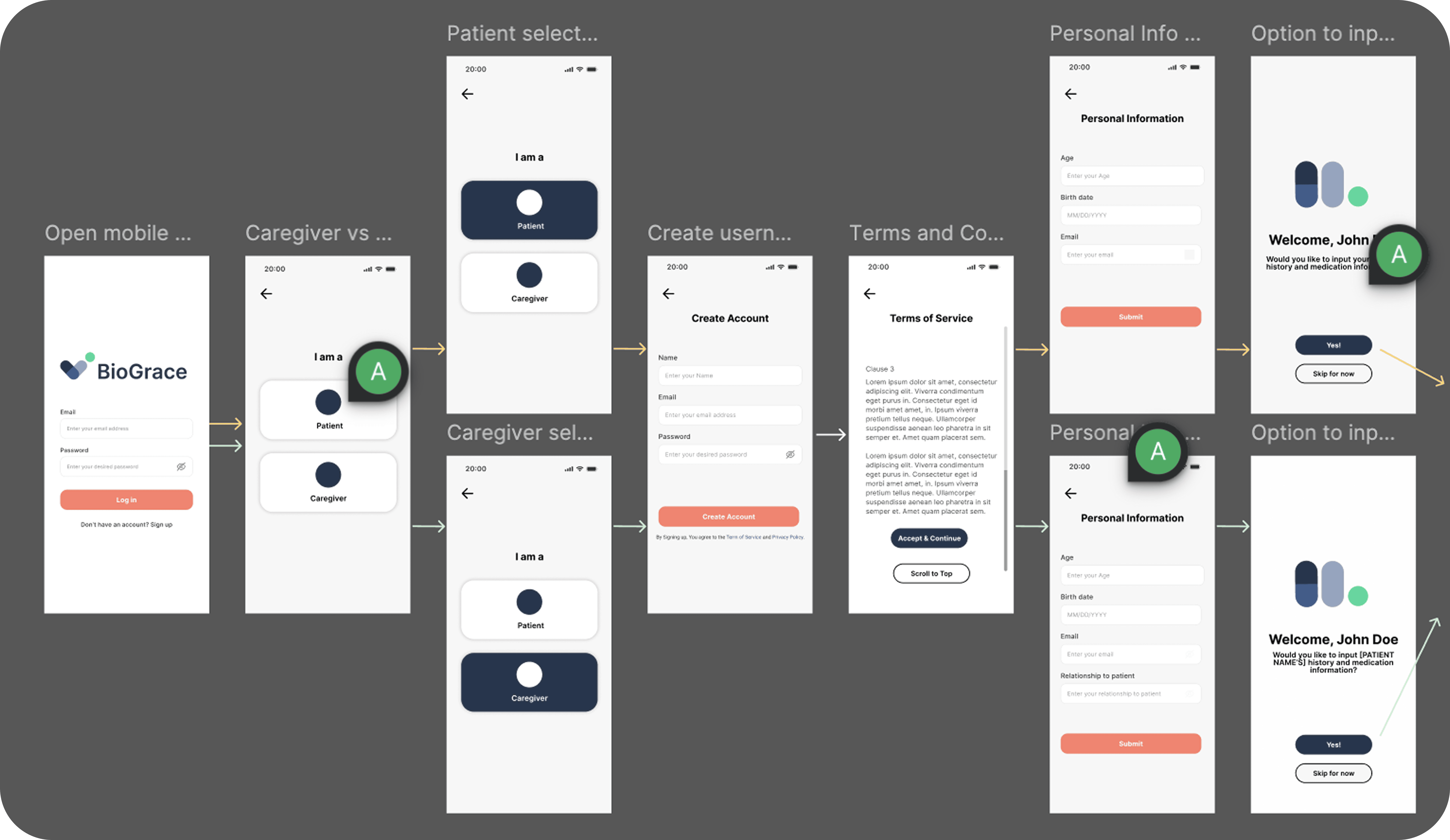
*A closer look at onboarding mid-fi wireframes
Final Solution
The final BioGrace prototype brings medication management into one centralized experience. Users can scan medication labels, confirm prescription details, set reminders, track daily progress, and ask Gracie questions about their medications.
*Medication scanning
*Gracie AI chatbot
Key Features
AI Medication Scanning: Users can scan a medication label to quickly input prescription information and reduce manual entry.
Gracie AI Chatbot: Users can ask medication-related questions in plain language, with guided prompts for common concerns like side effects, missed doses, and whether to take a medication with food.
Reminders + Tracking: A calendar view, task cards, and medication timeline help users understand what needs to be taken and when.
Priority Tagging: Users can assign priority levels to medications to better understand which tasks are most urgent.
Caregiver Support: Caregivers can receive SMS reminders and updates without needing to download the app.
Exportable Reports: Users can generate medication summaries to share with providers, family members, or other caregivers.
Building with Figma Make
After validating the core flows, we used Figma Make to turn our components, user flows, and mid-fi wireframes into a responsive interactive prototype. This stage allowed us to move quickly from static screens to a more realistic product experience, including chatbot interactions, notification flows, and responsive layouts.
Using Figma Make pushed me to think beyond static interface design and consider how each interaction would behave in a functional product. It also helped me explore how AI tools can accelerate prototyping while still requiring strong design judgment and user-centered decision-making.
Business + Technical Strategy
Because BioGrace was developed for the Tech Innovation Jam, we also considered the product’s business and technical feasibility. Our team explored market opportunity, a freemium pricing model, and a technical architecture using a mobile app, Firebase, React, Python, and an LLM-powered chatbot.
Collaborating across design, business, and technical strategy helped connect our product decisions to a broader plan for how BioGrace could be built, sustained, and brought to market.
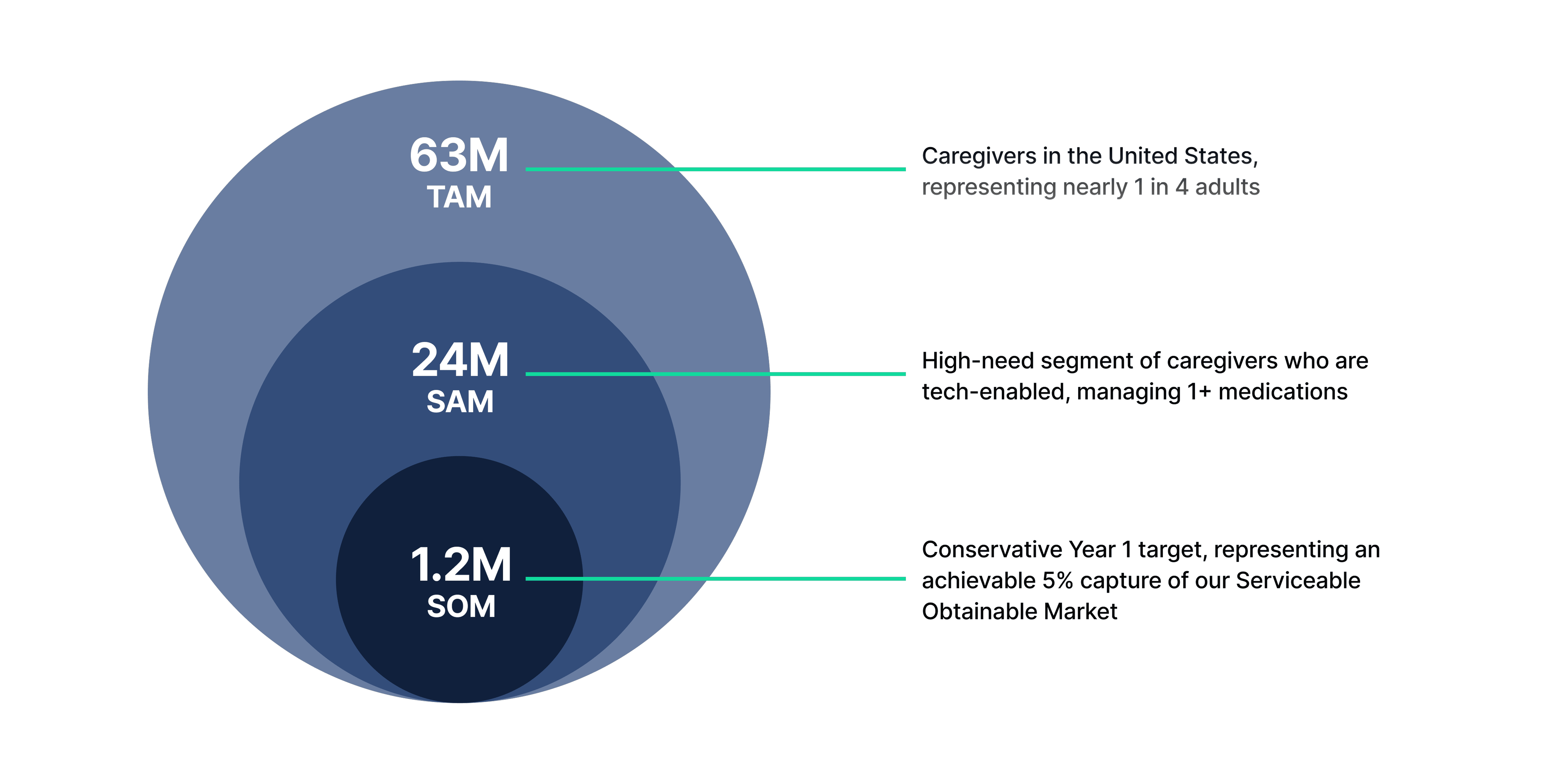
*Market analysis
Next Steps
BioGrace is currently an early-stage prototype. Moving forward, I would want to test the product with older adults, caregivers, and healthcare professionals to better understand how it performs in real medication management contexts.
Future iterations would focus on refining caregiver onboarding, strengthening AI safety and disclaimer patterns, expanding accessibility testing, and exploring privacy and data security considerations for sensitive health information.
Key Takeaways
This project reinforced the importance of mapping user flows early, especially when designing for a complex and emotionally sensitive problem space.
I learned how to translate real user pain points into simple systems that reduce confusion rather than add to it.
Working across design, business, and product strategy helped me understand how design decisions connect to feasibility, sustainability, and market fit.
Using AI tools throughout the process helped me move faster while still relying on user-centered thinking to guide decisions.
Most importantly, BioGrace reminded me that empathy is at the heart of usability. Designing for healthcare requires clarity, trust, and sensitivity at every step.
*Created in collaboration with Mia Goldstein, Agnes Mar, Kavya Aggarwal, and Emanuel Alcantara

