M-Access
Type
Product Design
Timeline
December 2023-February 2024

Project Overview
M-Access is a mobile app built to ease navigation for students, faculty, and staff with physical disabilities on the University of Michigan campus. It provides personalized, anxiety-reducing navigation by factoring in mobility aids (e.g., wheelchair, cane, crutches) and accessibility preferences (e.g., avoid stairs, prefer elevators, accessible entrances only). Unlike mainstream map apps, M-Access highlights specific building features like elevators, ramps, and wide entrances, empowering users to move confidently and independently around campus.
Problem Statement
Navigating campus is stressful for individuals with physical disabilities, especially when mainstream navigation tools don't account for elevators, ramps, or inaccessible entrances. This can lead to delays, detours, and a lack of autonomy.
Students and faculty should not have to pre-scout buildings, face the unknown, or rely on word of mouth just to get to class. M-Access helps take that stress away.
Research & Insights
87% of participants reported stress when navigating unfamiliar buildings.
2 in 3 disabled students said they were late or missed class due to inaccessible paths.
92% wanted the ability to customize routes based on their current mobility aid or condition.
Lack of real-time info about blockages or broken elevators adds anxiety and unpredictability.
Users expressed frustration that navigation apps on their phones do not provide options to guide them to specific building entrances based on their individual needs, which adds further difficulty to navigating campus.
“The most exhausting part isn’t walking—it’s the constant worry that I won't be able to get in or get out.”
– U-M Student, Temporary Crutch User
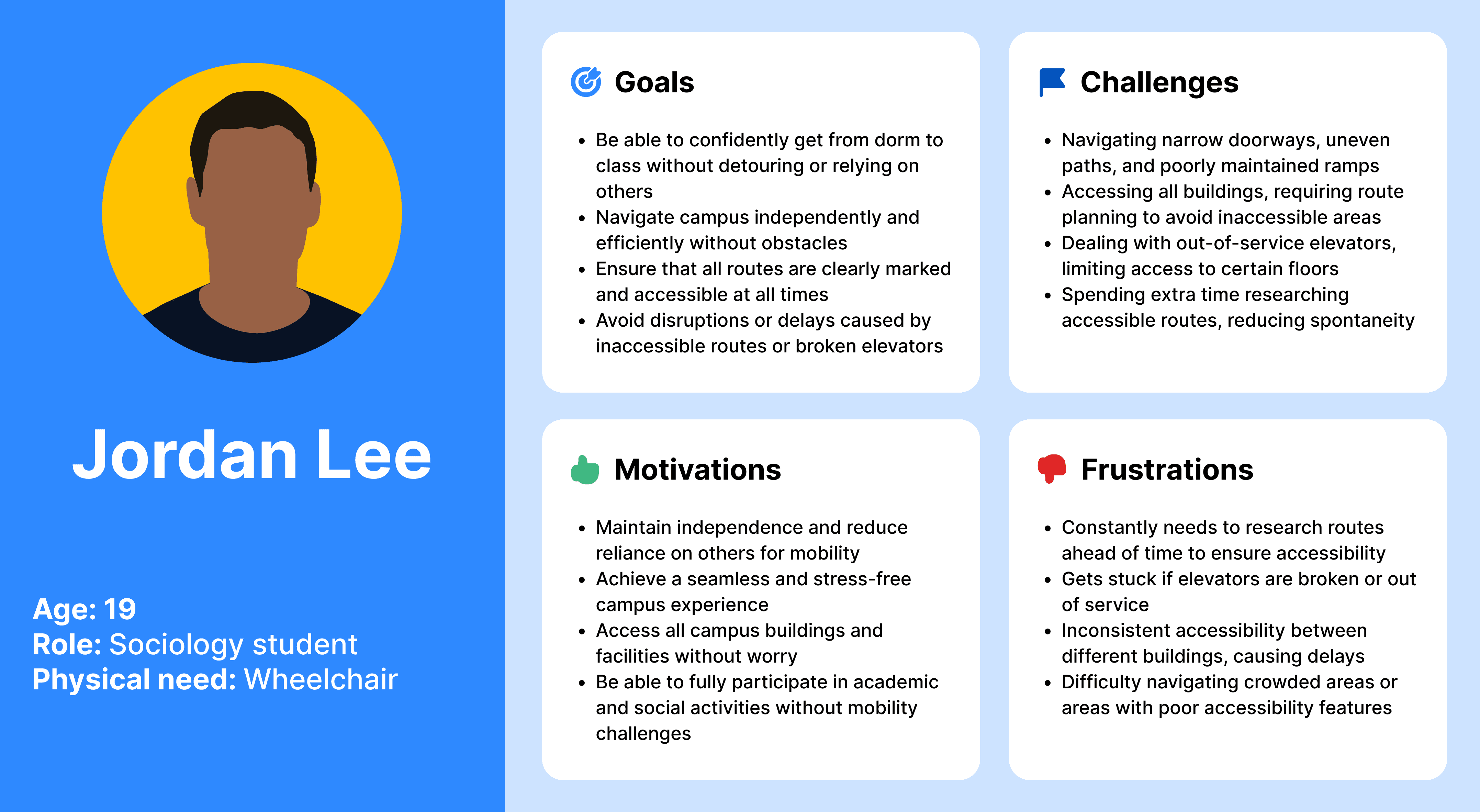
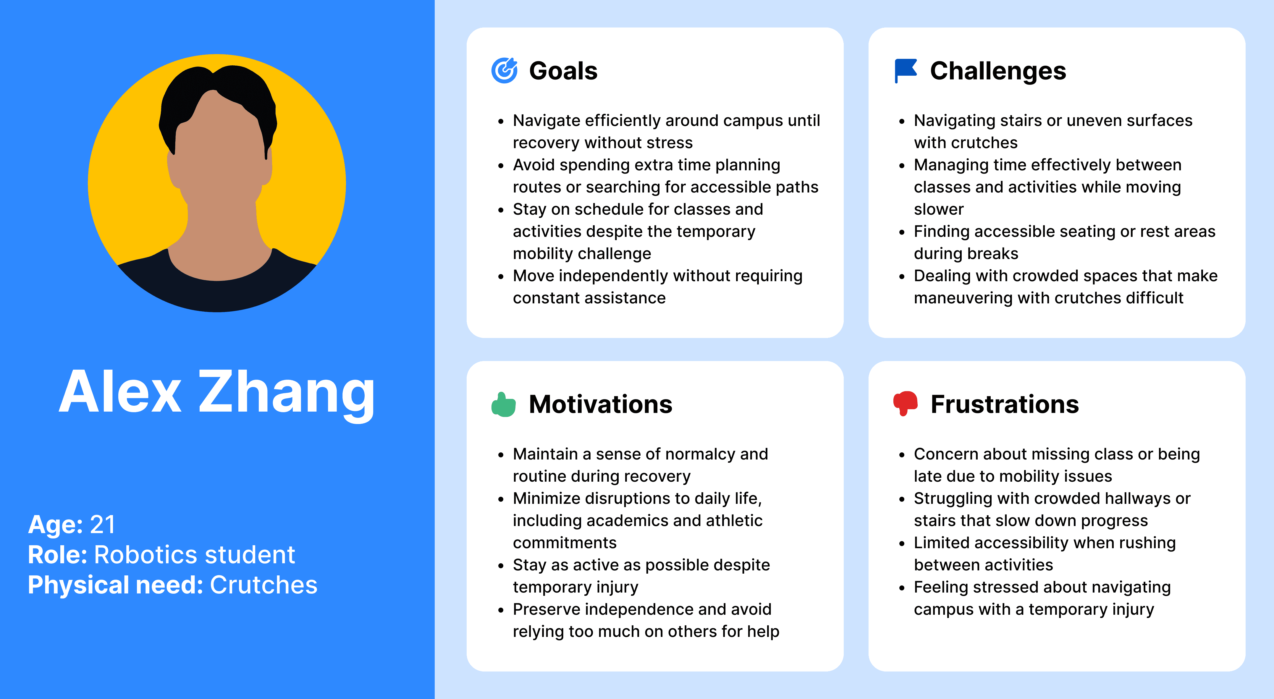
User Personas
Based on my research, I developed three user personas to represent the diverse experiences of individuals with physical disabilities on campus.

*User Personas
While each of these users faces unique challenges, common similarities emerge in their need for accessible navigation, frustration with unpredictable accessibility, and a shared desire for independence. Additionally, all three experience anxiety around completing daily tasks and arriving on time to campus obligations due to mobility barriers.
Design Goals
Eliminate anxiety by providing trustworthy, accessible routes
Give users the freedom to change preferences anytime (e.g., when switching aids)
Clearly mark accessibility features like elevators, ramps, and entrances
Allow saved routes and quick access to repeat journeys
Build a calming, empowering interface that’s sensitive to user experience
Design System
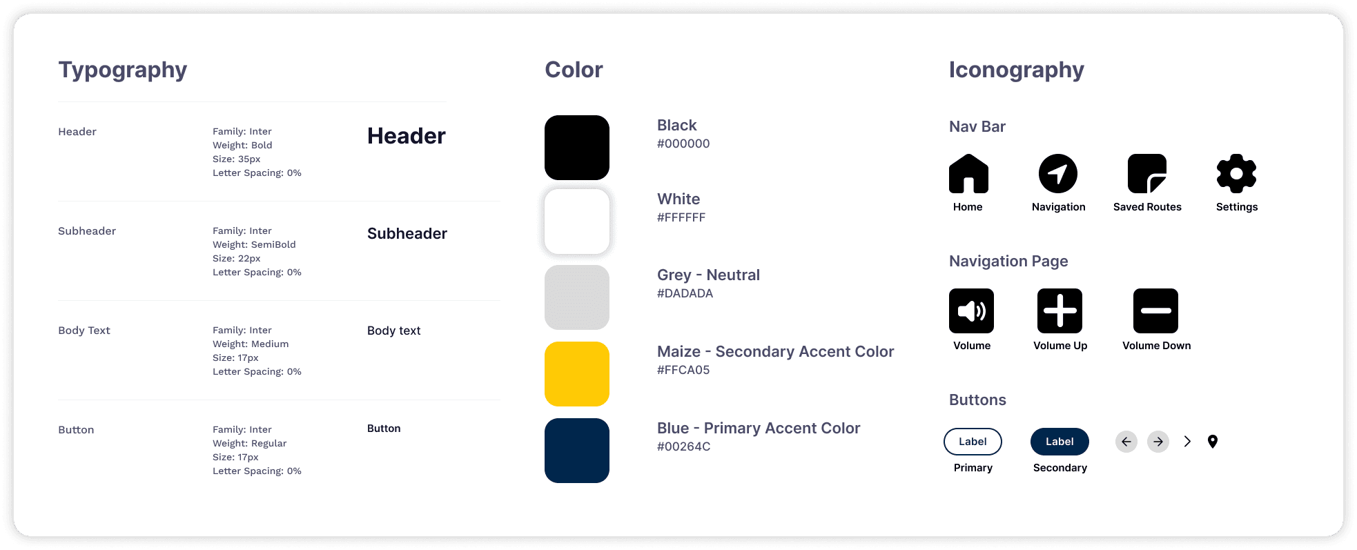
*Typography, Colors, and Iconography
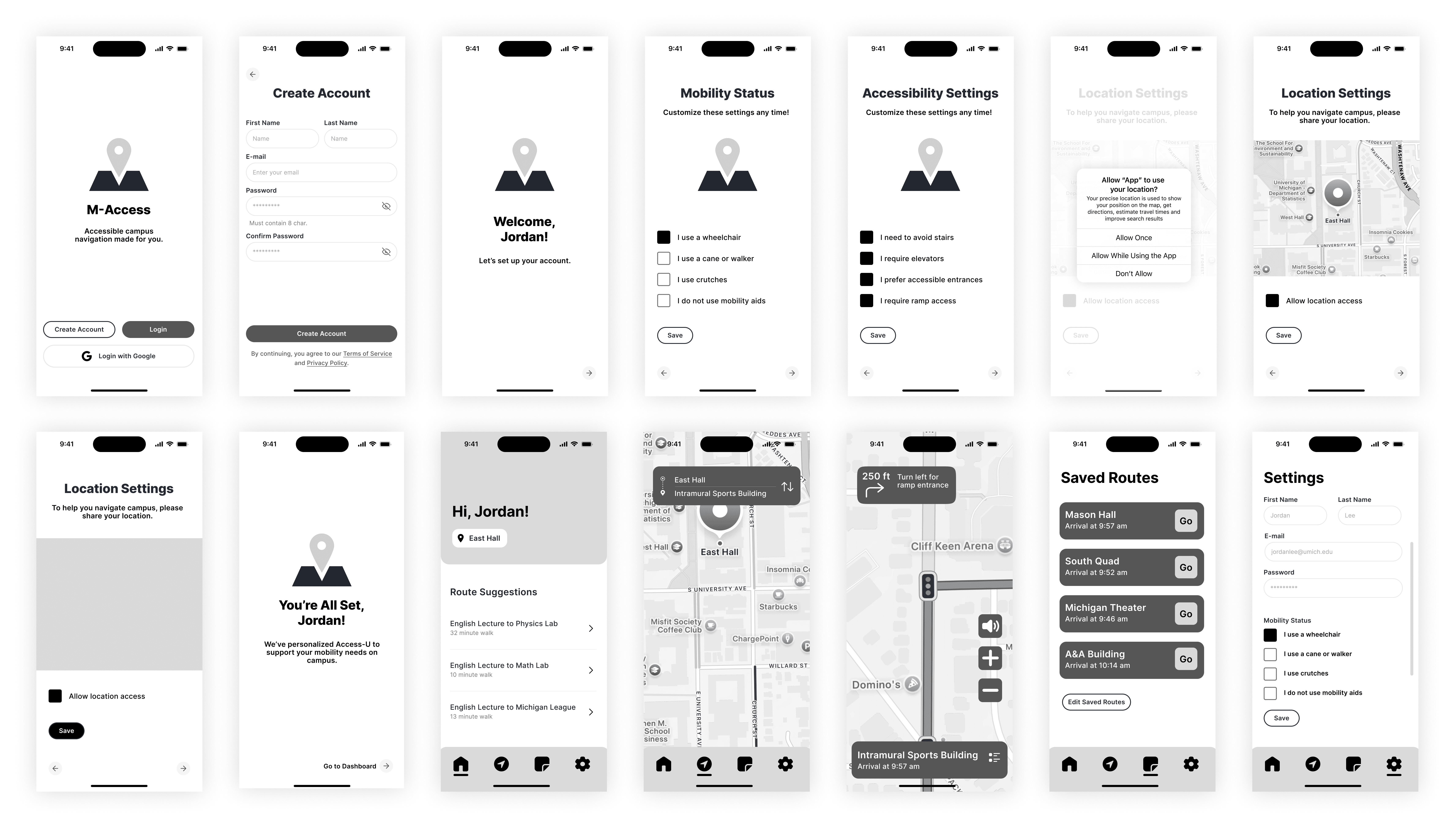
Lo-Fi Wireframes
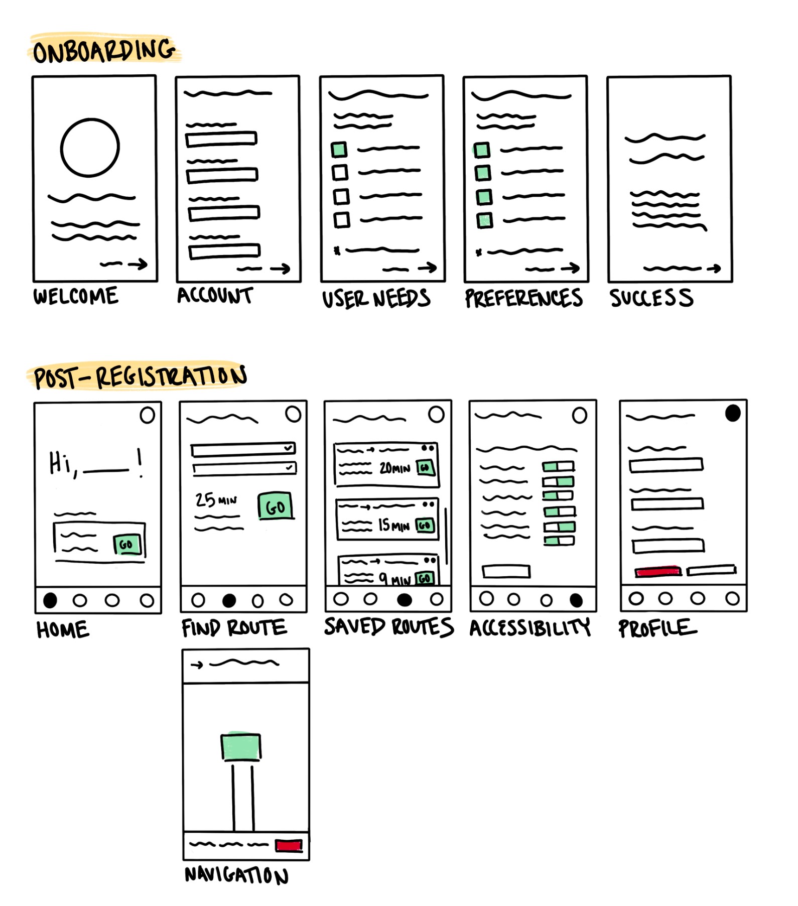
*Lo-Fi
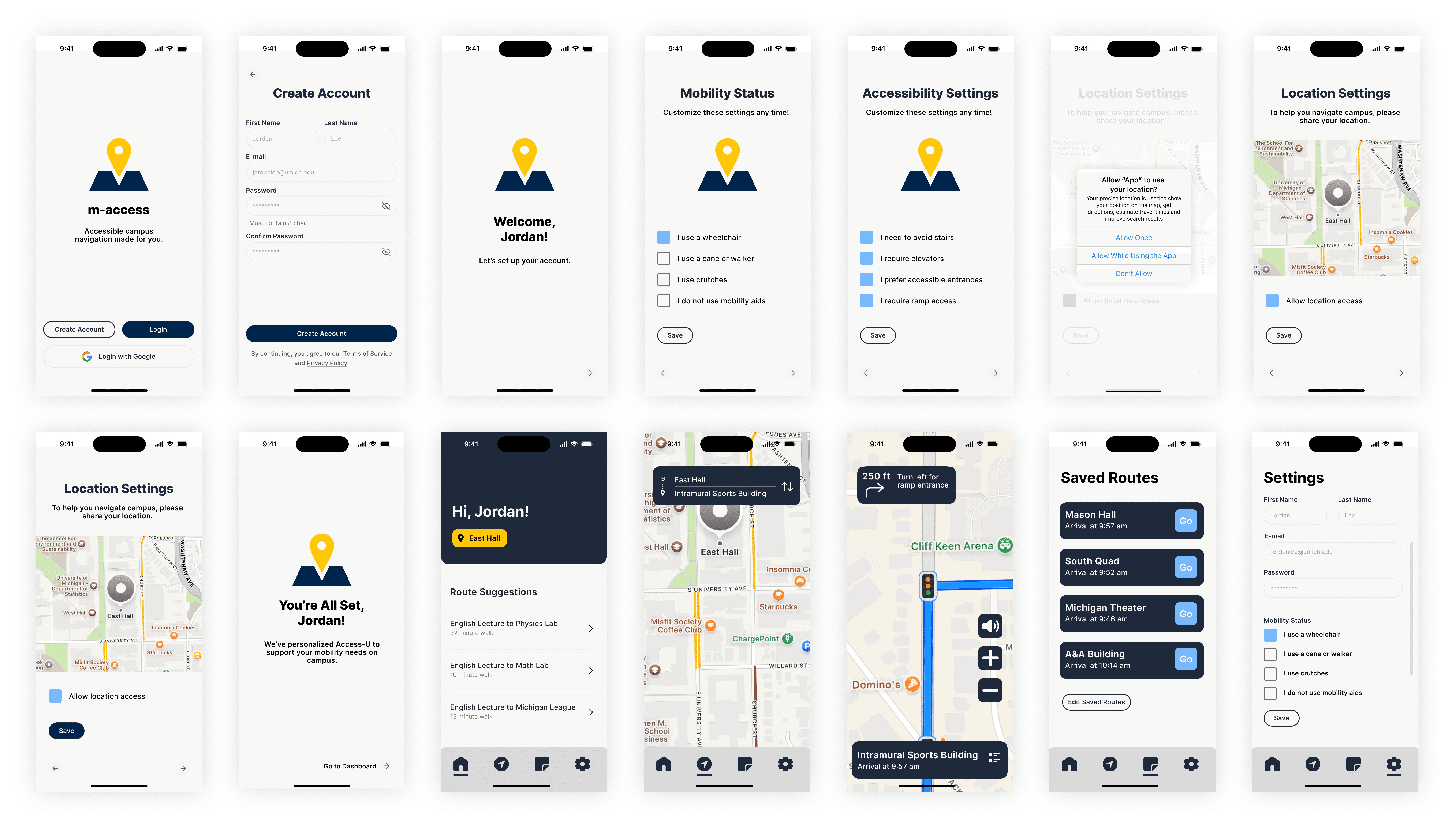
Hi-Fi Wireframes
*Hi-Fi - Based on 'Jordan Lee' user persona
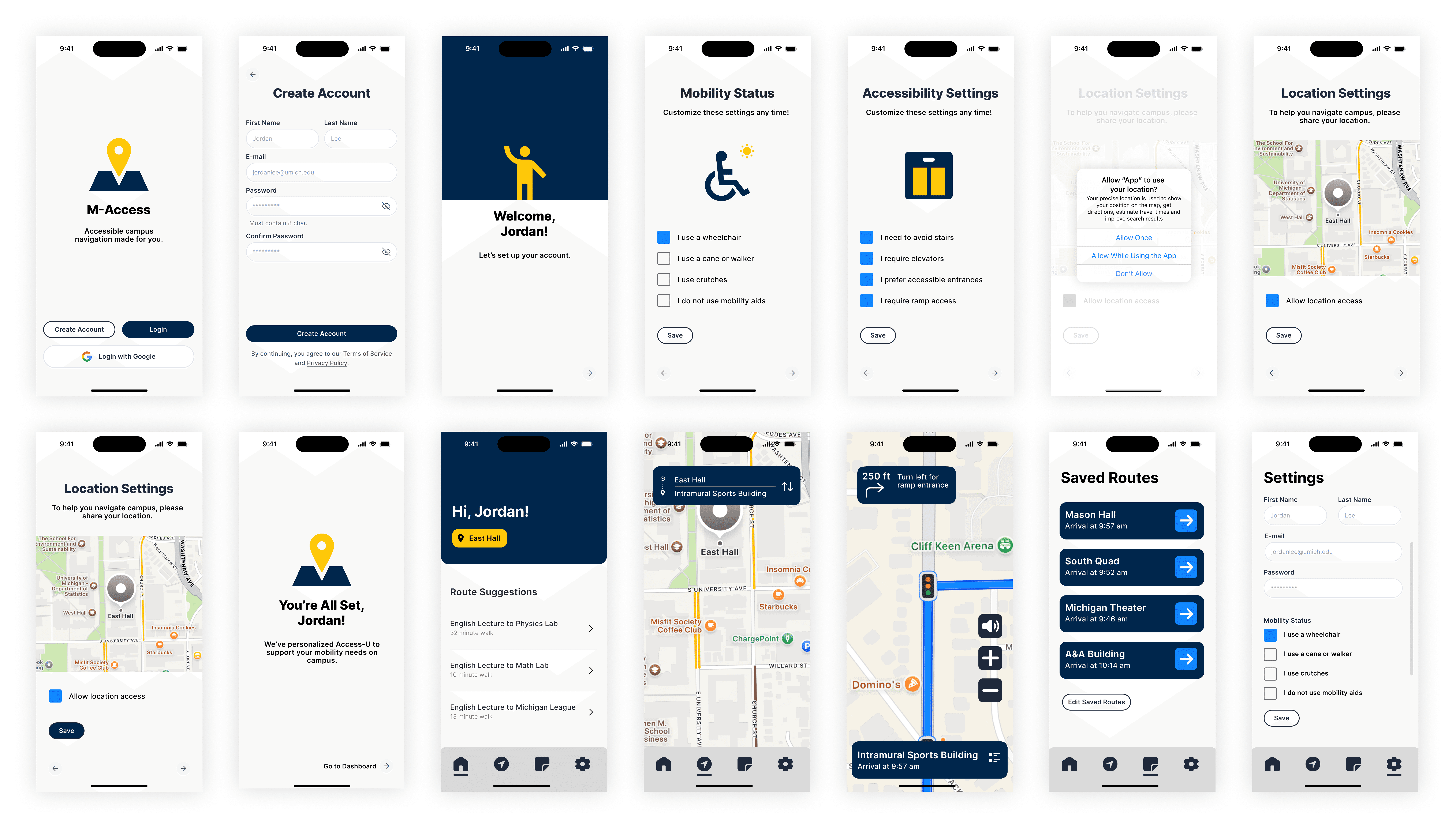
Iteration Process
*First Iteration
In the first iteration, the app featured a step-by-step onboarding process to capture user mobility, preferences, and location sharing. The home screen was clean, providing fast access to find or save routes. Route results displayed time estimates and accessibility options, while settings and profiles allowed users to easily update their conditions and preferences. Turn-by-turn navigation included in-building awareness, such as elevators and entrances. However, user testing revealed several areas that needed improvement.
The app didn’t meet the WCAG 1.4.3 minimum color contrast requirement in certain areas, which needed to be addressed to ensure better accessibility. Additionally, I made several design changes, including switching from m-access to M-Access for improved accessibility. Instead of reusing the logo across the welcome, mobility status, accessibility status, and completed onboarding pages, I replaced it with relevant iconography to provide clearer, more intuitive navigation. In the saved routes, I replaced the “Go” call-to-action (CTA) with an arrow symbol to reduce text on the screen and minimize cognitive load. I also increased the weight of arrows to improve their visibility and ensure better accessibility.
Final Solution
*Final design
Key Features
Custom Route Finder: Accessible directions customized by mobility aid and building features
Preferences Setup: Avoid stairs, prioritize elevators, or prefer automatic doors
Voice Command Feature: Users with mobility aids like canes or crutches cannot always hold their phone, highlighting the need for voice commands during navigation
In-Building Awareness: View ramps and elevators before entering
Low-Stress UI: Clear, uncluttered design for confidence and ease
Enhanced Accessibility: Increased target sizes and improved color contrast for better legibility
Next Steps & Future Improvements
Conduct user testing to identify areas for improvement and refine features based on real-world feedback.
Provide audio navigation and haptic feedback for low vision and blindness, low-stimulus mode for neurodivergent users, and shorter route options with sitting areas for users with chronic fatigue or pain.
Partner with the university to report elevator outages, construction zones, and blocked ramps, while sending push notifications to reroute users around inaccessible paths.
Allow users to flag real-time issues, such as blocked entrances or broken buttons.
Suggest routes based on schedules or campus events, and send reminders to update preferences (e.g., for temporary crutches or mobility aids).
Key Takeaways
Designing with Empathy: This app goes beyond just being a map—it’s about offering freedom, dignity, and peace of mind.
Anxiety Reduction = Accessibility: By eliminating uncertainty, we also reduce stress and make navigation easier.
Iteration is Key: The best solutions emerge through ongoing collaboration and genuine user feedback.
Accessible UX = Good UX: Features designed for marginalized users often improve the experience for everyone.
Understanding Diverse Needs: As a designer, it's essential to understand people different from yourself. I learned so much by interviewing individuals I hadn’t met before, which helped me design with real-world insights.

