Accessibility Guide
Role
Product Designer
Timeline
September 2026 - Present
Team
Independent Project

Overview
The Accessibility Guide is a speculative commerce platform bringing assistive products together with accessibility guides for businesses, events, and public spaces.
For this independent academic project, I’m designing the platform’s visual identity, component system, and interactive prototype, exploring how thoughtful design can make accessibility resources easier to find and understand.
Research & Opportunity
I began by exploring assistive technology marketplaces like MaxiAids and Rehabmart, alongside location-based resources like AccessNow.
My initial research highlighted an opportunity: accessibility resources are often spread across specialized platforms, with extensive product catalogs and varying approaches to organizing information.
I also consulted Empowering Accessibility: The Dynamics of Assistive Technology Acquisition, a Georgia Tech study examining how people with disabilities find and evaluate assistive products. The research highlighted the importance of clear product information, flexible search options, and recommendations from other users. One finding that stood out was the value of searching by everyday activities rather than solely by disability category.
How might we make accessibility resources easier to discover and navigate without sacrificing the information people need?
Visual Identity
The visual identity feels clear and confident, combining bold pictograms, strong contrast, simple geometry, and generous spacing to create an approachable and intuitive experience.
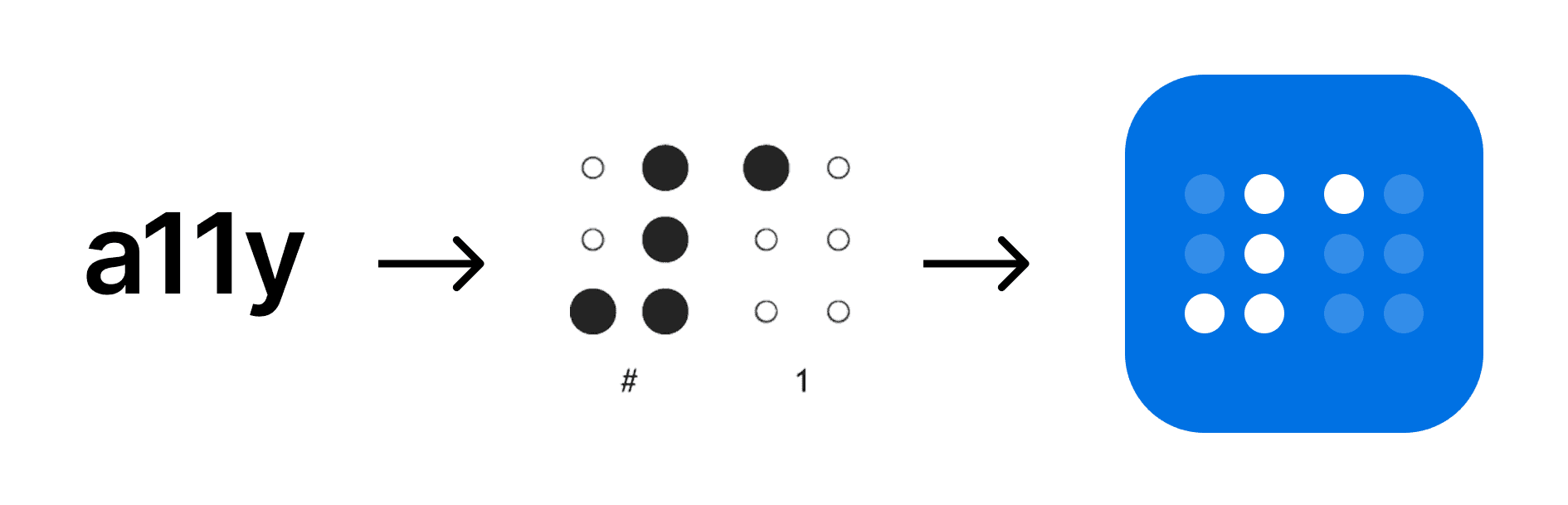
Inspired by a11y, the abbreviation for accessibility, I developed a Braille-inspired logomark using the numeric indicator and numeral 1.
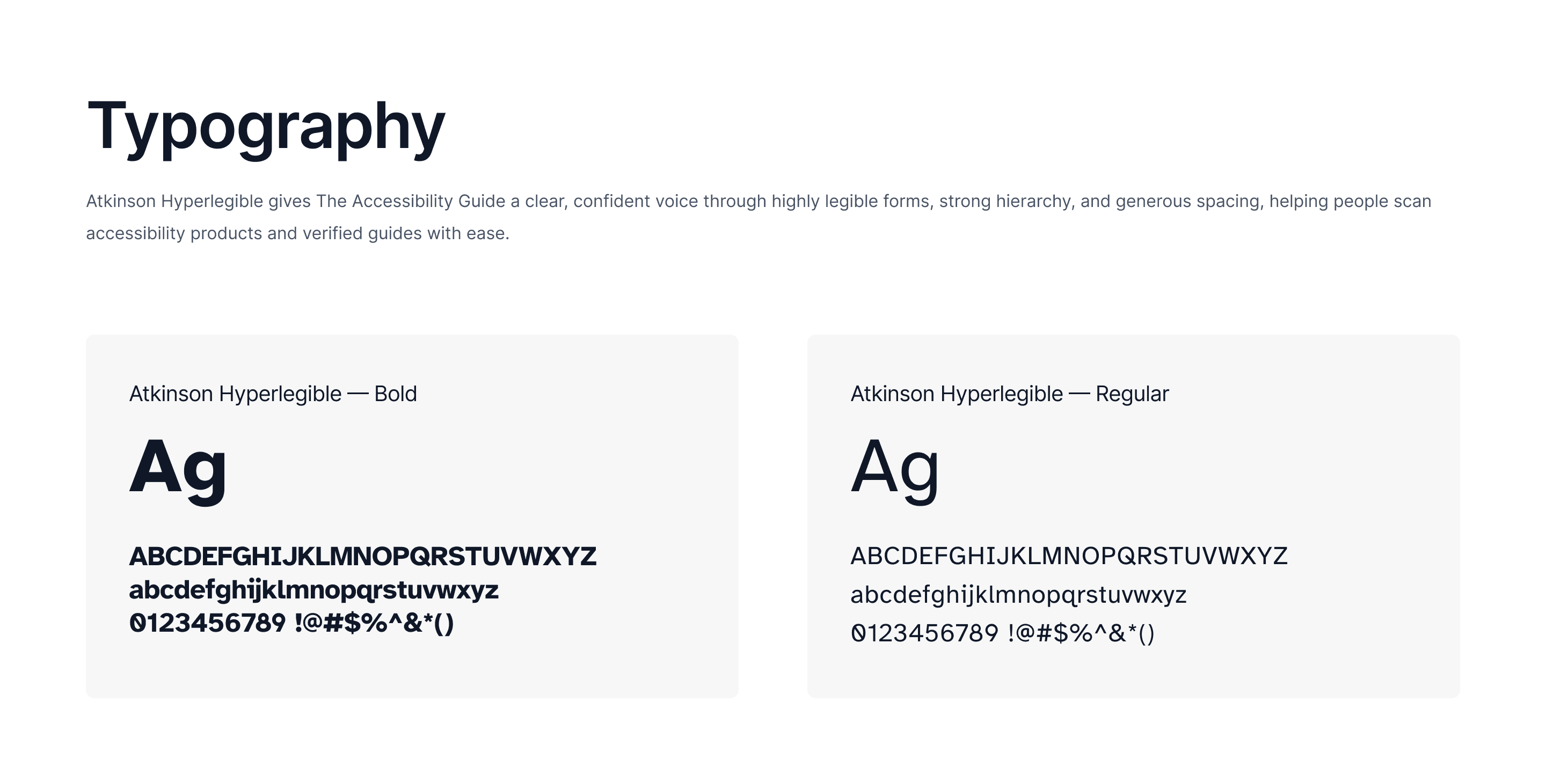
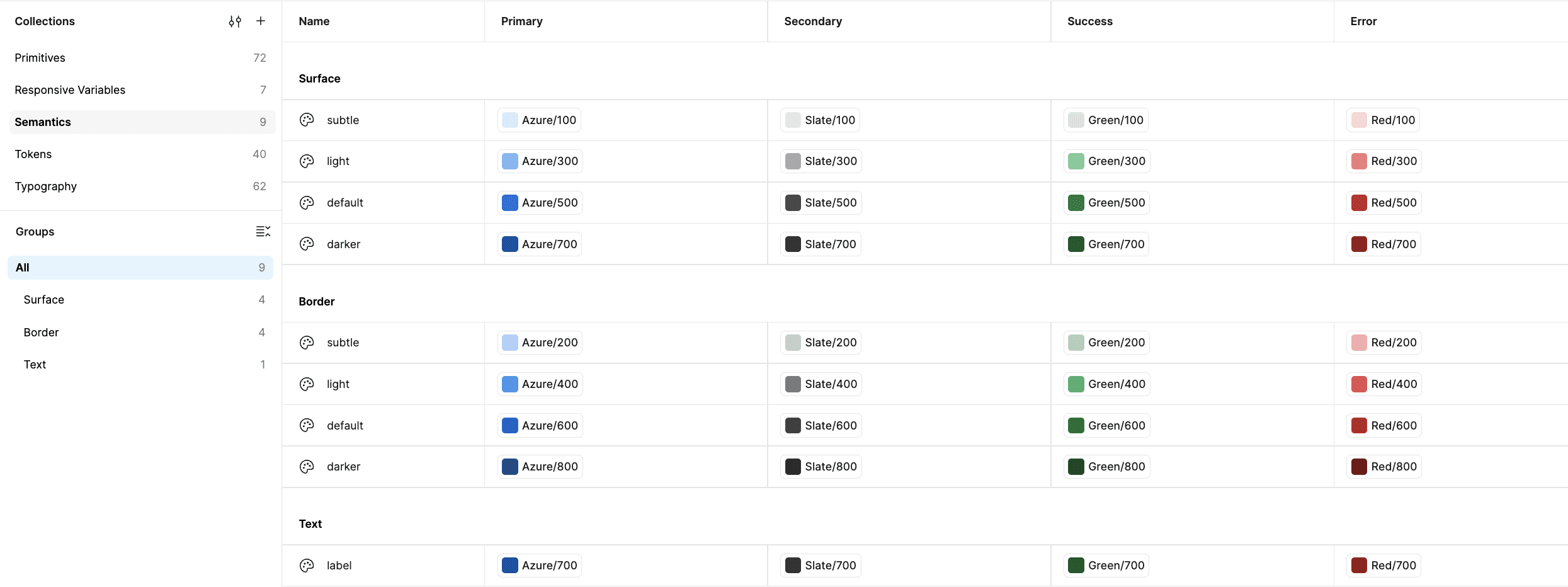
Atkinson Hyperlegible establishes a legible typographic foundation, while a vibrant Azure blue, neutral grays, and semantic color tokens create a consistent visual language that supports readability, hierarchy, and clear interaction feedback.
Design System
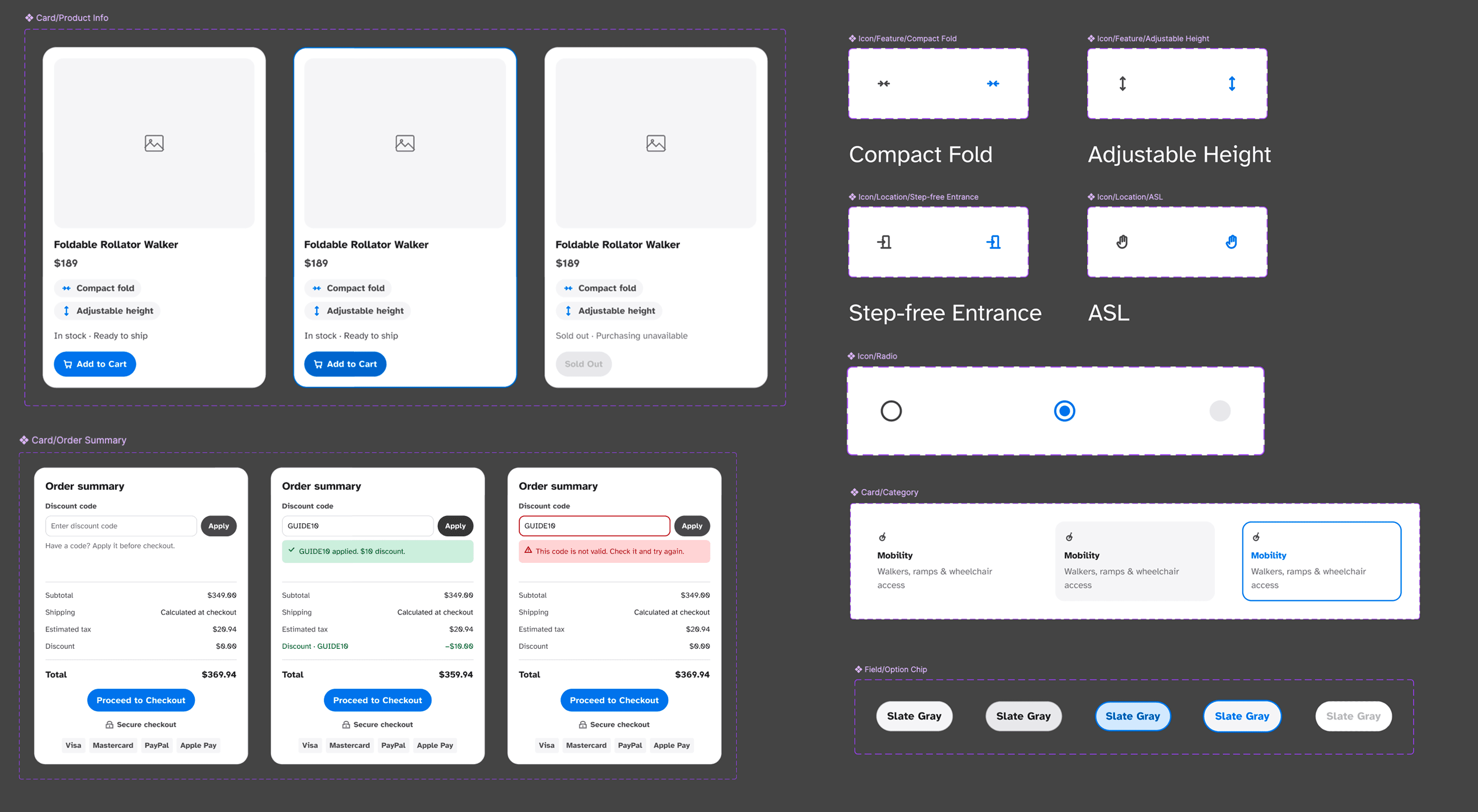
I’m developing a responsive component library built around reusable variables, semantic tokens, and consistent interaction patterns.
The system includes product and location cards, navigation, filters, buttons, and checkout components, each designed to accommodate different content, screen sizes, and interaction states.
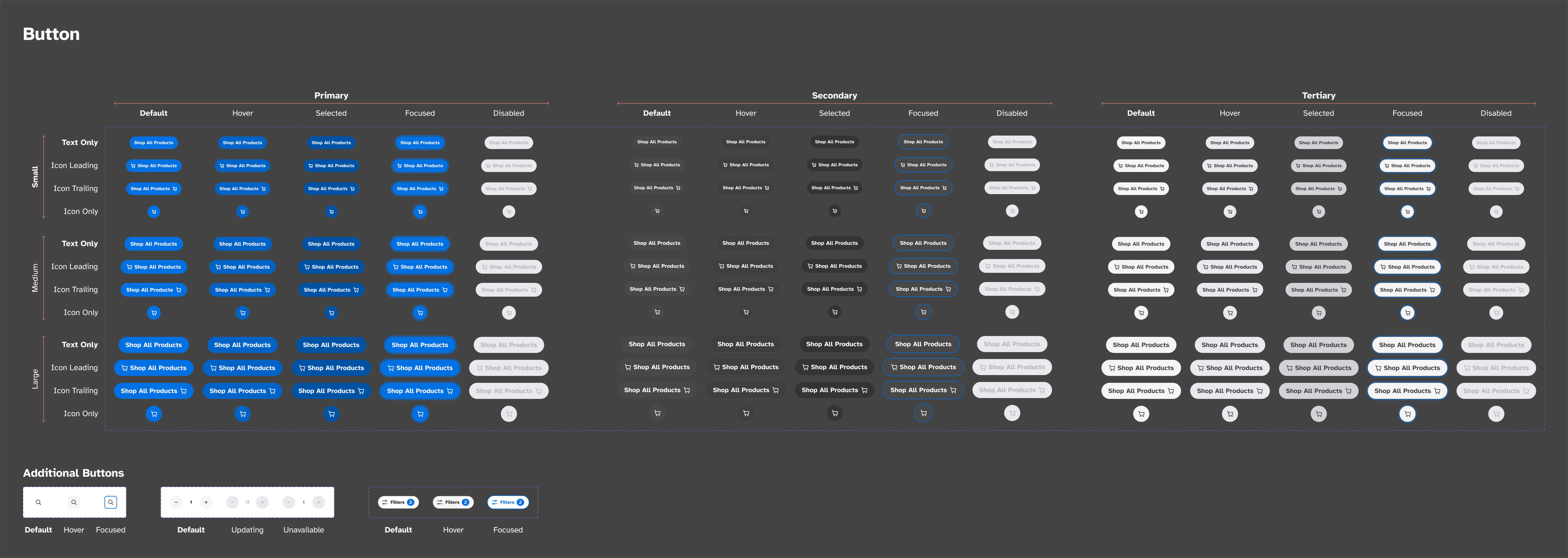
A particular focus has been designing beyond the default experience, accounting for focus, loading, errors, unavailable products, and other feedback that helps make interactions more understandable.
AI-Assisted Development
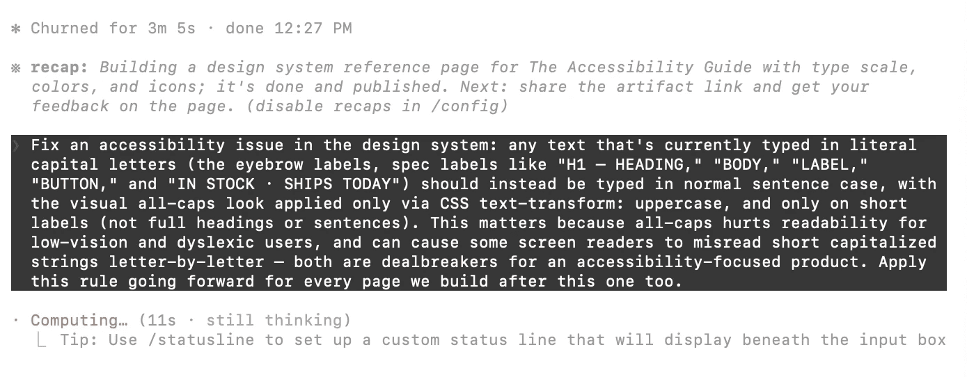
I’m using Claude Code alongside Figma to streamline repetitive component development, explore variations, and identify potential accessibility issues. By reviewing and refining AI-generated outputs, I’m able to focus on design decisions, interaction consistency, and accessibility while developing a functional, responsive prototype.
What’s Next
I’m currently refining the final designs and developing a fully functional, responsive prototype that brings the design system to life.
As development continues, I hope to conduct usability testing with disabled participants and assistive technology users to challenge my assumptions, identify barriers, and inform future iterations.
My goal is to explore how accessibility can shape not only the final interface, but the entire design process.
Interactive prototype and usability testing findings coming soon.

