KTP Life App
Type
UX Design
Timeline
May-July 2024

Project Overview
Kappa Theta Pi (KTP) is the premier professional technology fraternity at the University of Michigan, accepting only about 6% of applicants each semester based on technical interest, professional development, academic standing, and more. The KTP Life app, created to facilitate member engagement and scheduling, helps prospective members (rushees), new members (pledges), and active members (brothers) manage and navigate their event schedules. However, with a busy semester filled with overlapping events, such as chapter meetings, rush events, social gatherings, and committee meetings, students often felt overwhelmed by the sheer volume of information.
Problem Statement
Previously, all events on the app’s calendar page were displayed in the same blue color, making it difficult for users to differentiate between various types of events. This lack of visual distinction caused frustration, particularly during busy periods like rush, when the calendar was overcrowded with multiple event types. Users needed a way to filter and visually distinguish between event types, which would create a more organized, focused, and manageable calendar experience, ultimately improving user satisfaction and engagement.
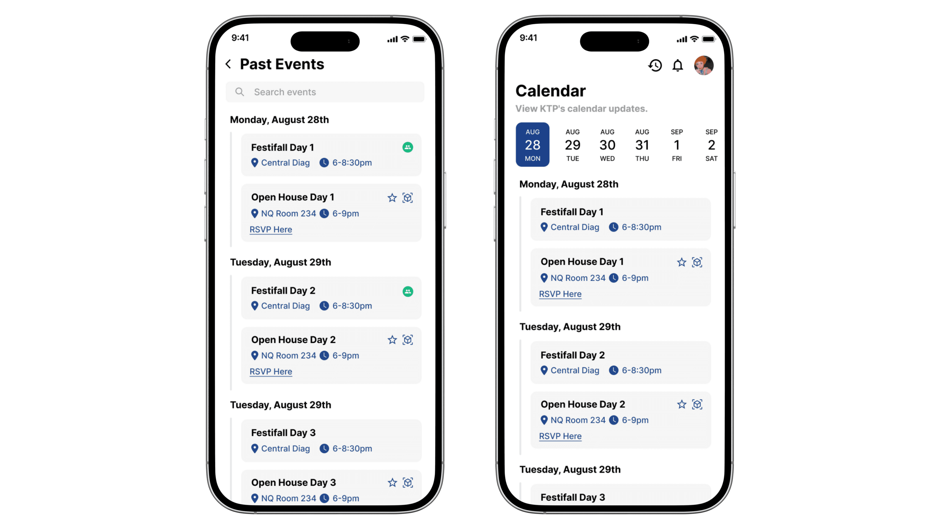
*Previous designs
Types of Users
The app's primary users are Kappa Theta Pi members, including rushees, pledges, and brothers, who each have different event needs:
Rushees need to focus on rush events.
Pledges need to focus on mandatory pledge events and chapter meetings.
Brothers need to focus on chapter events and mandatory meetings but may not need to see rush or social events.
Design Goals
Introduce color-coding for different event types, allowing users to easily differentiate between events.
Allow users to filter events by type (rush events, mandatory events, social events, committee meetings, chapter meetings) so they only see what’s relevant to them.
Give users the option to customize the color for each type of event to further personalize their experience and make the calendar more user-friendly.
The calendar system needed to allow these different members to focus on events that were specifically relevant to their role in the fraternity.
Iteration Process
In the first iteration of the design, each event type was assigned a fixed color. This solution addressed the problem of visual differentiation between event types, making it easier for users to identify the events at a glance. However, user feedback revealed two key areas for improvement:
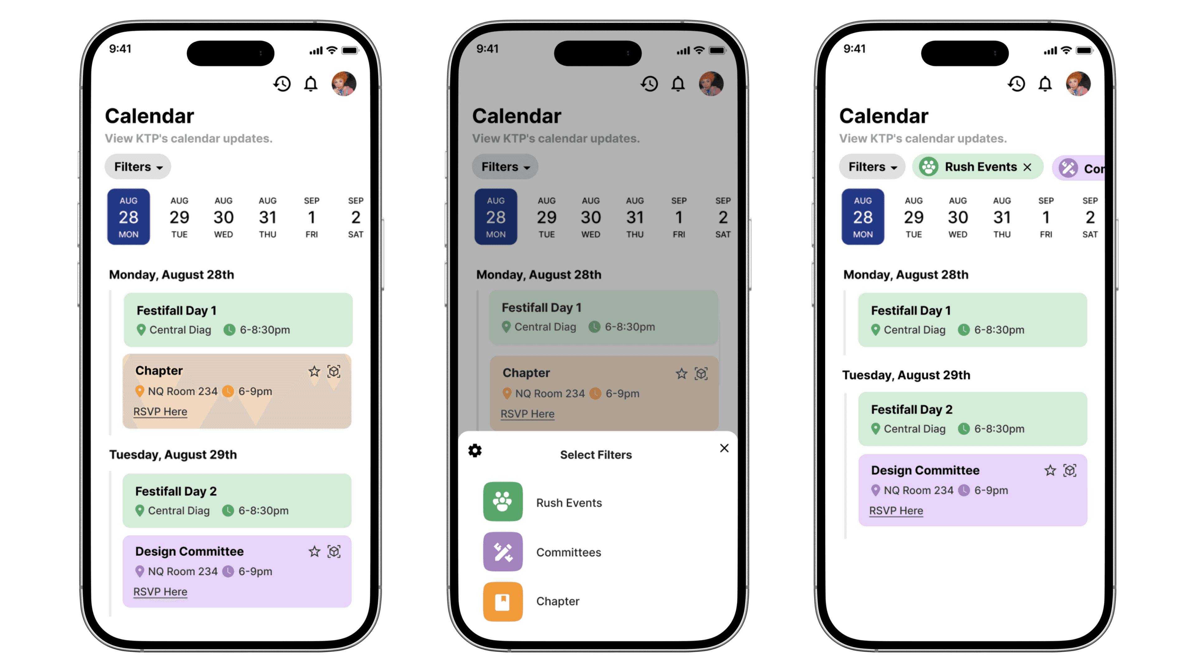
*First iteration
Lack of Customization: While the color-coding system helped to distinguish events, users felt they lacked the ability to personalize their experience. Allowing users to choose their preferred colors for different event types would give them more control and enhance their experience.
Overwhelming Design: The use of full-bleed color across the entire event card, though effective for differentiation, was found to be somewhat distracting. Users felt that it made the calendar appear too busy and cluttered, especially when multiple events overlapped.
As a result of this feedback, we realized the need for a more flexible, user-centered approach that combines both visual distinction and customization.
Final Solution
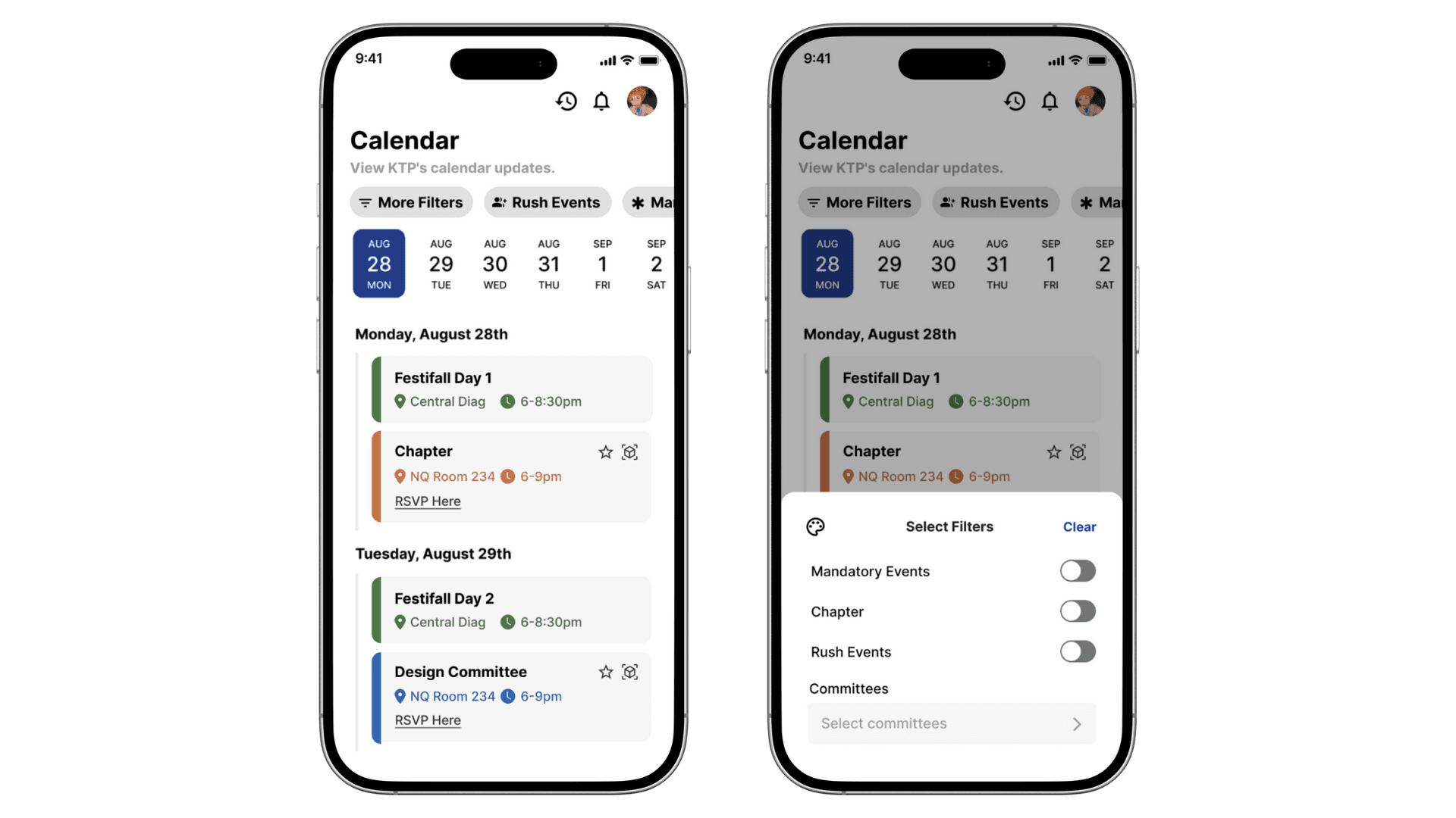
*Final design
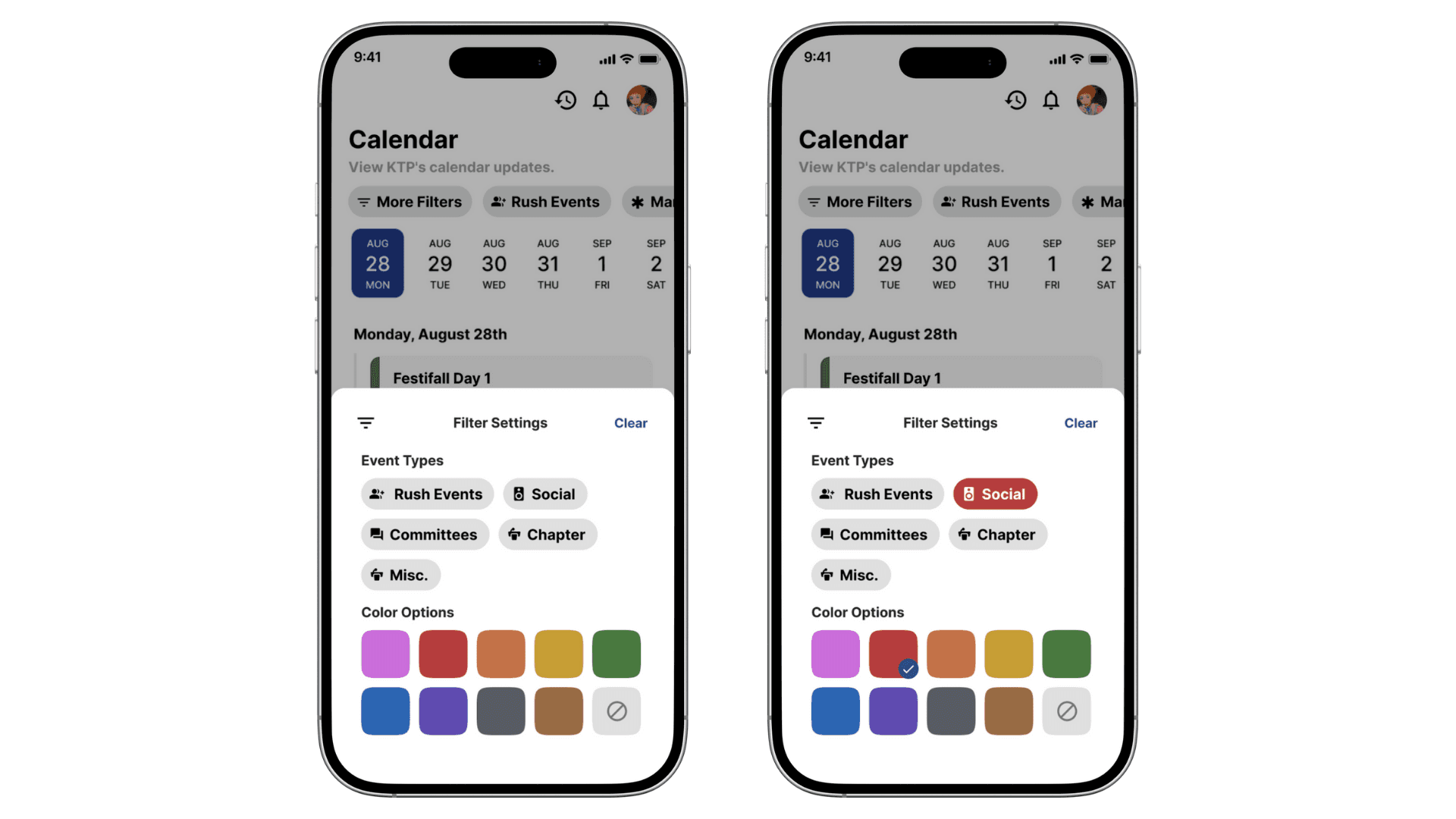
Key Features
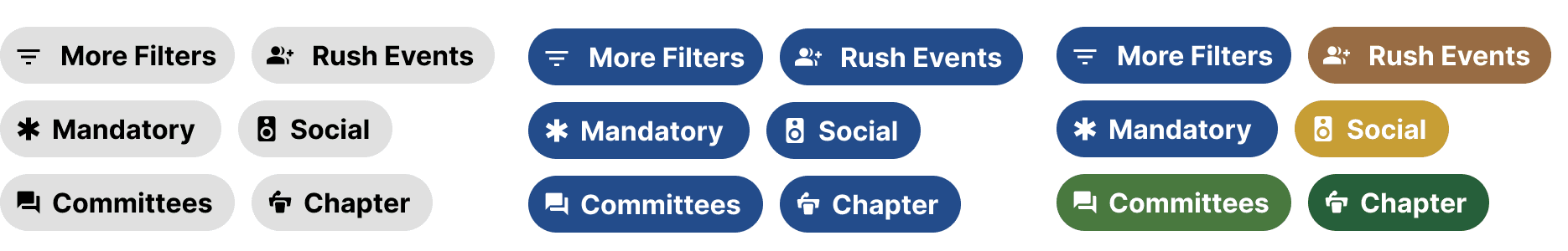
*Filters can be customized to the user's preferred color; if not set, they default to blue
Event Color-Coding: Events are assigned distinct colors (e.g., red for social events, green for rush events), which can be customized by users.
Calendar Filters: Users can filter events by type (rush, mandatory, social, committee, chapter), ensuring they only see relevant events.
Next Steps
The feature has been successfully integrated into the KTP Life App by the development team, which can be found in the App Store for easy access and download.
The filtering and color-coding feature can be expanded to include more event categories as the fraternity grows, offering greater flexibility for users.
Key Takeaways
Collaboration with Designers and Developers: Working with other designers and developers throughout this project helped refine the feature’s design and ensure it met technical requirements. The collaboration made the integration smoother and ensured that user needs were prioritized in the final product.
Visual Design: Color-coding and intuitive filtering systems are crucial in creating a streamlined and user-friendly experience.
Download the KTP Life App in the App Store!

